SRL Archive - Other

[12M Prize] Make YoHoJo Some 'Button Graphics'!


YoHoJo

2012-07-20 01:46:47

Once again holding a competition for some graphics!

Here is a link to last time's thread:
http://villavu.com/forum/showthread.php?t=84851
Remember, we have some pretty talented guys here so just as a warning don't waste your time if you're not too good <3!

Here is a copy/pasta from a writeup I did for myself:

Membership Buttons:
http://www.runescape.com/img/main/members_benefits/upgrade_us.png?1
Cut out the Gem/Golden surrounding.
Have one ruby(leave alone), one diamond, and one dragonstone looking one.

RuneCoin Buttons:
Feature this guy somewhere:
http://images.wikia.com/runescape/images/c/c1/Solomon_concept_art.png
On each button write how many RuneCoins it will get you.
If you find other RuneCoin related things/graphics that would be nice.

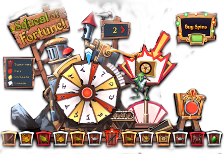
Squeal of Fortune Spin Buttons:
http://www.runescape.com/img/main/gameguide/images/sof/more-spins.png
OR
http://3.bp.blogspot.com/-iH9a-UAnH9s/T01WWwE8XgI/AAAAAAABSjE/Bai0wcuiUZw/s1600/image_1.jpeg

Cut out just the wheel, or the wheel and some of the &#8216;machine&#8217; too, whatever looks good.
Make it the image for the buttons.
On top of each image/button write (in some nice bold font that fits) how many spins it will get you.


So basically I'm expanding to sell RuneCoins and Squeal Spins.

Currently the 'buttons' look quite plain:
http://memberize.me/#stock

So I'd like the membership ones remade, and new ones made for coins and spins.

The size, shape, artwork, creativity is all really up to you! Whatever you think will look best!
Just needs to look good and be Runescape Related/Related to what each button is for buying.


From: Kyle Undefined
As long as each thumbnail image, the one you click on to see information about the product, is 290x217 all will be good. Sorry for the confusion.


Any further questions can be asked here.
Take your time! Can't wait to see them!

Kyle Undefined

2012-07-20 01:55:34

Might want to add that the overall size of the images must be the same that's on the current site. I don't care what's done with the images, just as long as they all have the same square size as the ones pictured.

(s)okkr7

2012-07-20 02:09:52

edited out

YoHoJo

2012-07-20 02:20:29

Thanks for the attempt, but I think other people will be able to do better than that by a lot :/ sorry! Feel free to keep trying though!

Not sure about fonts it's up to you really whatever looks nice with it!
The website is linked above www.memberize.me


If you were just showing a super ghetto mockup and were going to make it much better, then yes that is what I'm looking for :]

(s)okkr7

2012-07-20 02:35:12

From: YoHoJo
Thanks for the attempt, but I think other people will be able to do better than that by a lot :/ sorry! Feel free to keep trying though!

Not sure about fonts it's up to you really whatever looks nice with it!
The website is linked above www.memberize.me


If you were just showing a super ghetto mockup and were going to make it much better, then yes that is what I'm looking for :]


Last sentence says it all, whipped it up in one minute and plan on making it mucho better ;)

Sin

2012-07-20 02:38:42

Hmm, wondering how much for 75 spins :p

Wishlah

2012-07-20 10:31:53

I think 'obtained' is spelt wrong on your site, first sentence under Stock ^^

Soo you want 3 membership buttons and how many different spin/coin buttons? And is Kyle saying that the size of each button has to be the same as the above? or by 'overall size' is he talking about the combined width of each category (membership/spins/coins) has to be the same as the above just so it looks neat on the page?

Just kinda confused lol.

shstiger2009

2012-07-20 10:38:42

Yeah YoHoJo, obtained is spelled wrong where it says it under "Stock" as well as weird spacing in the rest of that paragraph…it will look better if you fix that! ;)

Joe

2012-07-20 10:43:19

From: shstiger2009
Yeah YoHoJo, obtained is spelled wrong where it says it under "Stock" as well as weird spacing in the rest of that paragraph…it will look better if you fix that! ;)


YoHoJo… I keep telling you, you look like a chinese goldfarmer with these spelling mistakes :p

Vinyl Scratch

2012-07-20 11:14:31

^ Lol. And, to hell with it, I'll open Flash back up.

Kyle Undefined

2012-07-20 11:37:28

From: Wishlah
I think 'obtained' is spelt wrong on your site, first sentence under Stock ^^

Soo you want 3 membership buttons and how many different spin/coin buttons? And is Kyle saying that the size of each button has to be the same as the above? or by 'overall size' is he talking about the combined width of each category (membership/spins/coins) has to be the same as the above just so it looks neat on the page?

Just kinda confused lol.


As long as each thumbnail image, the one you click on to see information about the product, is 290x217 all will be good. Sorry for the confusion.

I think he wants new Member Upgrade image thumbnails, three new thumbnail images for the SoF, and four new thumbnail images for the RuneCoins. If that makes any sense.

From: shstiger2009
Yeah YoHoJo, obtained is spelled wrong where it says it under "Stock" as well as weird spacing in the rest of that paragraph…it will look better if you fix that! ;)


He needs to learn how to spell better :p As for the weird spacing, it's because of the amount of text. I'll look into it.

Joe

2012-07-20 11:44:43


There you are my good sir.
It's like a 30 second version… but where's my 12M? :D

I did some text editing and thought it was neat.


EDIT:
Heres my result:


YoHoJo

2012-07-20 17:15:14

Best entry so far:
http://i.imgur.com/kSkj3.png
And it's not even 100% perfected/complete yet.
So if you don't think you can beat that, don't waste your time :].

EDIT: It's made by Zyt3x

The Killer

2012-07-20 17:22:51

From: YoHoJo
Best entry so far:
http://i.imgur.com/kSkj3.png
And it's not even 100% perfected/complete yet.
So if you don't think you can beat that, don't waste your time :].


damn nice. i might give it a go but then again i'm not very good

Joe

2012-07-20 21:58:10

Screw my old copy- unless you liked it. I got some more cooking up (read the OP)
EDIT: Zyt3x doesnt have SHIT ;)

YoHoJo

2012-07-20 22:07:59

I CHALLANGE you to one up Zybez!
Based on your blue flames crap I don't see it happening!!!!!!!!!!
:)

Frement

2012-07-20 22:20:59

Sure, I'll beat that :)


Joe

2012-07-20 22:40:37

From: YoHoJo
I CHALLANGE you to one up Zybez!
Based on your blue flames crap I don't see it happening!!!!!!!!!!
:)


:O :(
:(
How dare you! :D
I spent 3 whole minutes making that for your chinese gold farming site!
I will be back…
I pwn nubs with my photoshop skillz

Frement

2012-07-20 23:33:29

Google + RS website + text tool + magic wand =

6:33 AM, sleep ->

Gu3st...

2012-07-20 23:37:36

From: Frement
Google + RS website + text tool + magic wand =

6:33 AM, sleep ->
THERE we go! :D

Knew *someone* would do it properly

NKN

2012-07-21 00:31:41

Get Wislash to do it, he's amazing. :)

Sneakily

2012-07-21 05:11:15

I shall return tomorrow with an entry out of this world.

Joe

2012-07-21 08:23:54

From: Zyt3x
THERE we go! :D

Knew *someone* would do it properly


Lol, I haven't done it yet… just be patient. :D

Sneakily

2012-07-21 18:59:04

http://sneaky.minus.com/mFQN1X1jJ/
Made first 3.

YoHoJo

2012-07-21 19:14:34

I like the gem part of it, the color of dragonstone is too light purple, but all the gems etc look nice.
As for the Text and BG a bit too simple, I do like a minimal design, but I think Frement/Zyt3t's entries are more in line with what I'm looking for.

Thanks for effort, feel free to keep trying!

Joe

2012-07-23 09:44:15


This is an honest attempt… just like the blue flames dragon :p
seriously though, what do you think?

putonajonny

2012-07-23 11:01:13

Thought I'd give this a crack… what do you think about the colours? (not done yet):
And it needs to be 290x217 like this one: http://memberize.me/images/projects/thumb_w1.jpg ?

The Killer

2012-07-23 11:08:51

From: putonajonny
Thought I'd give this a crack… what do you think about the colours? (not done yet):
And it needs to be 290x217 like this one: http://memberize.me/images/projects/thumb_w1.jpg ?

gz on 1,200 post count :p
ot: he says in op that its up to you on size

edit: had a go myself, ik its not very good atm, what do u like and hate about it? how could it be improved? im not a big fan on current fonts (know any that would look good?)
edit2: noticed the picture is huge, wouldn't want it to be that big ofc

yuhuyu

2012-07-23 11:25:31

hey do you have spins for sale?

Joe

2012-07-23 13:54:53

From: yuhuyu
hey do you have spins for sale?


YoHoJo imposter! lol yohojo vouches his own threads too?

YoHoJo

2012-07-23 16:27:32

From: Joe


This is an honest attempt… just like the blue flames dragon :p
seriously though, what do you think?


D: Sorry man still not rubbing me the right way <3.

From: putonajonny
Thought I'd give this a crack… what do you think about the colours? (not done yet):
And it needs to be 290x217 like this one: ?


Diamond is a bit pink, dragon-stone is too light, you've got he right idea though!
And yeah overall the entire buttons must be that size.

From: The Killer
gz on 1,200 post count :p
ot: he says in op that its up to you on size

edit: had a go myself, ik its not very good atm, what do u like and hate about it? how could it be improved? im not a big fan on current fonts (know any that would look good?)
edit2: noticed the picture is huge, wouldn't want it to be that big ofc


I like the idea Solomon looks awesome and I like how he is 'presenting the offer' the piece of paper or whatever!! Looks like a great start for sure! Just better font and stuff would be good.

I'd like Solomon on left side, and 3 pieces of paper or whatever you wish the button to look like as a great starting idea.

Joe

2012-07-23 16:40:49

From: YoHoJo
D: Sorry man still not rubbing me the right way <3.


I get what this is about… you just like being rubbed- you sick minded person!
</3 :( :(
Well at least I gave it an honest attempt.
Me outi

Kyle Undefined

2012-07-23 17:14:11

From: putonajonny
Thought I'd give this a crack… what do you think about the colours? (not done yet):
And it needs to be 290x217 like this one: http://memberize.me/images/projects/thumb_w1.jpg ?


Yes, as explained here http://villavu.com/forum/showthread.php?p=1072749#post1072749

From: The Killer
gz on 1,200 post count :p
ot: he says in op that its up to you on size

edit: had a go myself, ik its not very good atm, what do u like and hate about it? how could it be improved? im not a big fan on current fonts (know any that would look good?)
edit2: noticed the picture is huge, wouldn't want it to be that big ofc


It's not up to you on the size, I've stated what size it needs to be. See http://villavu.com/forum/showthread.php?p=1072749#post1072749 :)

From: YoHoJo
D: Sorry man still not rubbing me the right way <3.


Diamond is a bit pink, dragon-stone is too light, you've got he right idea though!
And yeah overall the entire buttons must be that size.


I like the idea Solomon looks awesome and I like how he is 'presenting the offer' the piece of paper or whatever!! Looks like a great start for sure! Just better font and stuff would be good.

I'd like Solomon on left side, and 3 pieces of paper or whatever you wish the button to look like as a great starting idea.


Update the OP with my explanation that I linked above you noob :p It's VERY important on the size.

yuhuyu

2012-07-23 19:09:52

From: Joe
YoHoJo imposter! lol yohojo vouches his own threads too?


aww no one respond me u.u

Joe

2012-07-23 20:18:06

last try…
if this doesn't rub you right- if you catch my drift :garfield: then you should hire a graphic designer who suits your needs.

EDIT: I hope your eyes bleed.

Frement

2012-07-24 03:11:22

From: Joe
last try…
if this doesn't rub you right- if you catch my drift :garfield: then you should hire a graphic designer who suits your needs.

EDIT: I hope your eyes bleed.


Even while this topic is in off topic section, you should still tune down the spam. You post way too much pointless posts (Not talking about this topic alone, but in general).

MrEvill

2012-07-26 05:56:50


YoHoJo

2012-08-19 15:06:50

Bump

Sin

2012-08-19 15:20:58

Post 37 is really nice, as well as Zytex's, but I think Frements' button takes it.

Joe

2012-08-20 11:07:58

From: Shay
Post 37 is really nice, as well as Zytex's, but I think Frements' button takes it.


I'd have to go with Zytex's… or mine

Mat

2012-08-20 11:14:04

Frement to win he's is sick :D

Sin

2012-08-20 11:48:30

Joe I hope you're trolling >=3

Joe

2012-08-20 12:31:41

From: Shay
Joe I hope you're trolling >=3


I actually love Zytex's… it looks so clean cut. Frement's is just lots of gold swirleys and I don't know how well it would look on YoHo's website.
The site is slick. A decorative button would seem out of place.
Frement does have a really nice button I just think that its not suited for the site.
If you mean me nominating myself.
I uz chroling