mrpickle
2009-06-12 06:03:38
Fourth - Screw Fonts

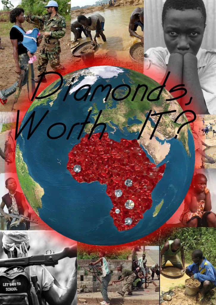
Third - Font better?
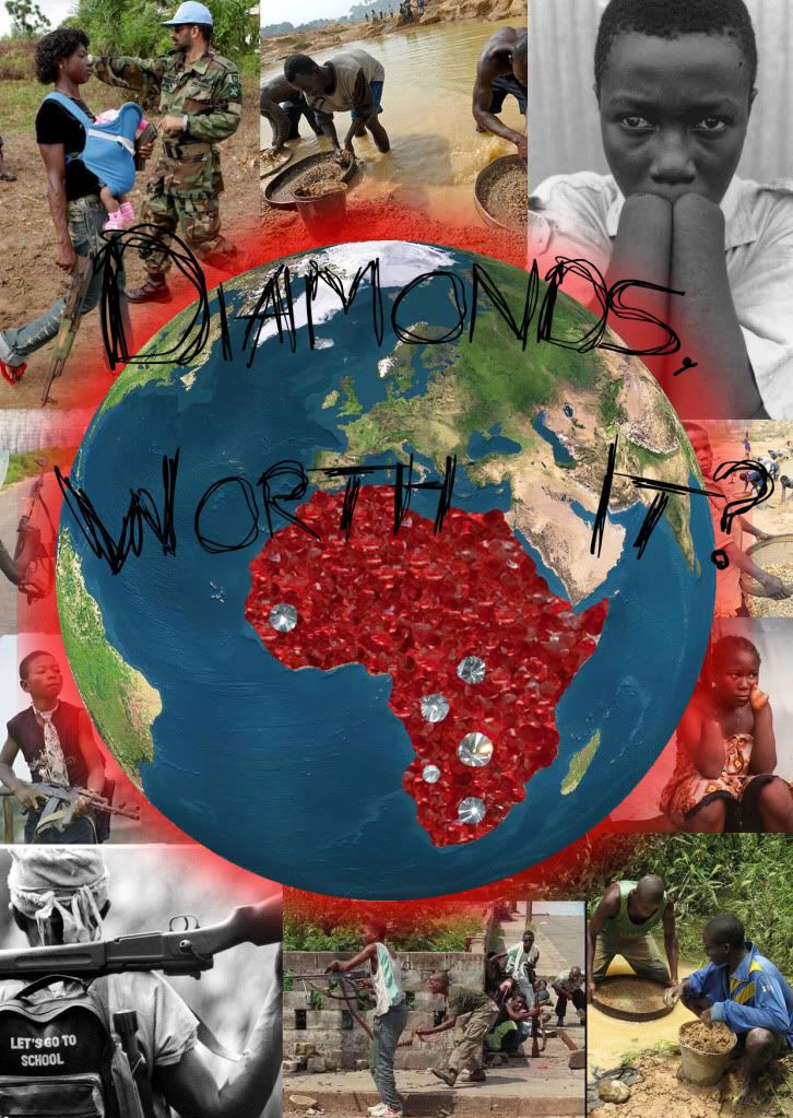
Second - Hated Font
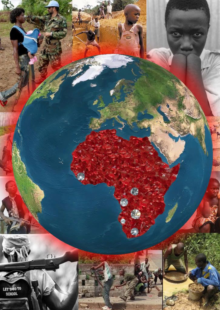
First - Too big of Globe
Took all images / image references from the net.
Buckleyindahouse
2009-06-12 06:05:24
Blood diamonds..
It really gets the point across, that's why I, myself do not like diamonds.
Good job.
mrpickle
2009-06-12 06:12:37
Thanks =D. Is there anything you find unfitting or not right in the picture? I still have 3 days to complete ^^.
Edit: be back tomorrow… have to sleep for examz.
senrath
2009-06-12 06:21:19
From: Buckleyindahouse
Blood diamonds..
It really gets the point across, that's why I, myself do not like diamonds.
Good job.
It doesn't help that diamonds are a really boring stone to begin with.
@mrpickle: I'd scale down the globe a little bit. Right now their are two pictures where only a tiny portion is visible.
Buckleyindahouse
2009-06-12 06:32:31
From: senrath
It doesn't help that diamonds are a really boring stone to begin with.
@mrpickle: I'd scale down the globe a little bit. Right now their are two pictures where only a tiny portion is visible.
Yea, downsize the globe some more to show off the other pics hidden by it, they will still be able to see the red africa with the stones in it.
Coh3n
2009-06-12 07:02:01
The pictures fit nicely, especially the one with the kid carrying the gun and says "let's go to school". It really gets your point across. But yeah, downsizing the globe would make it more effective for sure. :)
Nice work. :)
Justis
2009-06-12 11:03:58
Wow, very nice :)
I agree, either shrink the globe, or remove it and just have Africa in diamonds in the center.
mrpickle
2009-06-15 05:20:13
Ok, updated the pictures. slight change between all 4 of them… sorry about the huge pictures xD.
Da 0wner
2009-06-15 05:30:53
Looks very nice. Good job :D.
And that boy is carrying an AK woot :p.
senrath
2009-06-15 06:10:05
Pretty good. Although I'd use "Diamonds. Worth it?" instead of "Diamonds, worth it?"
mrpickle
2009-06-15 06:11:22
And I would too =D. Thanks for input. I'll add that to my own Files. Enuf uploading and picture spamming xD.
Torrent of Flame
2009-06-15 14:47:35
2nd one, text is better. But look at the glow on the left side of the globe, there is flat line. Might want to sort that.
Innocent muse
2009-06-15 19:18:16
I like the scratchy text the most. I think you should've taken the globe and brush it so it blend in (kind of transparent around the edges?) with the images around it.
I think that would look killer.
EDIT: Although if this is a montage you have to print and put together, that'd be impossible.