P O O N4GE
2007-07-31 11:57:46
Hmm..
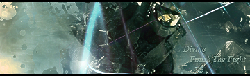
You do good work, then slap on a sh*** text?
Why do you use such text like that? it spoils the picture, n u have any .PSd files of these?
could i have a look?
looks like something i could learn from.
dns divine
2007-07-31 12:15:07
ya i could send you some .psd files from them and ya i kno my text is really bad i wouldnt put on their but i do so i can claim my work ya know i hate text…
btw P O O N4GE nice sig you got their too
P O O N4GE
2007-07-31 12:51:09
Me too I'm not fan of text, If you notice my sig's mainly have a 'K' symbol, much easier than text.
And i posted a tutorial on my sigs if u wanna check it out, the style is the same ones in my Sig, so im gonna much sum other ones up next week.
Oh btw, do you use a lot of clipping masks in your Sigs? just wondering it looks similar to one i tried with clipping masks.
and yeah, could you upload some PSD files for me, n post/PM the link please.
Thanks.
Edit : text tip that might work for you;
Just slap on some text anywhere, then hide the layer.
Make a new layer, and apply image.
Then un-hide the text layer below.
And use a clipping mask.
Move the layers around abit until you find a nice spot.
just makes the text look more natural, and the colors match a lot better.
dns divine
2007-07-31 14:30:49
ya ill up load some in a bit for u i have a .psd file that i let ppl look at my work and learn from but none of the sigs are posted up on here because i didnt want to go look for them in my photobucket lol and thanks for the tip also ill try your tut always loved tuts!
P O O N4GE
2007-07-31 14:53:22
But do you have PSD's similar to the owns you done there?
dialeyj2
2007-08-11 21:36:05
sweet, how do you make those
kaustav_002
2007-08-11 23:17:08
Dont you have anything better to do than ask dum questions and semi gravedig?
Its called photoshop btw.